ragged float


Advanced CSS, served hot and fresh for your enjoyment! Come 'n' get it!
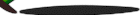
First there was slantastic and then curvelicious, which showed how to get text to flow along curves and straight diagonals. The next step seemed obvious: to get text to flow along an irregular outline. Thanks to curvelicious, it turns out to be much less complicated than one might expect. In fact, to create a layout with text flowing along an irregular outline should require nothing more than to replace the curve with a different set of images... a set where the images are of varying widths the may be wider or narrower than their neighbors.
This is another demonstration that really benefits from changing the text size, particularly in the smaller direction. The smaller the text, the more easily it will "wrap" itself to a rough outline of the image shown.
Wow! What's the Catch?
Unfortunately, browser support isn't everything one might hope. The big problem is with browsers not being completely aware of where a line's content might be drawn. This leads them to write some text over some graphics, which might be a desirable effect under other circumstances but is unwelcome here. This problem affects Opera in some cases, and also IE5.x/Windows on occasion. The only major difference is that in IE5.x, the text will be overwritten by the floated images, whereas in the others the text overwrites the images. IE5.x/Mac runs into the same problem that felled it in slantastic, which isn't too bad but it might make some layouts look a bit odd. It does manage to avoid having text overlap the floated images, at least.
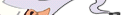
These do not seem to be overly troublesome bugs. You'll note that while the image I chose to use has very large "peaks" and "valleys," the text doesn't flow into them. That's because I used the images to "fill" the valleys by making them a lot wider than they needed to be. Images 1 and 19 are the places where this happened, as you can see here:
There is danger is outlines that have too large a degree of variation in how far they protrude into the text flow. An image with more a more severe outline, so to speak, might cause text to overlap the images, or vice versa.
How It Works
If you've already seen and understood curvelicious, this will be old news, but I'll go through it again for those who are new to this particular idea.
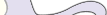
All I did to make this happen was create a 300x200 image of a curve. Then I sliced it up into twenty strata, each one 15 pixels tall and only as wide as necessary to show that particular part of the graphic without any clipping. Here are four of those images in row, this time with borders around them so we can clearly see their dimensions:
Stack all twenty strata together (without the borders, of course) and we get the complete image. But float those twenty strata so that they stack up, and text can flow around them. Thus:
img.chef {float: left; clear: left; margin: 0 1em 0 0;}
The margin helps keep the text away from the floated images; the greater the margin value, the further away text will be pushed from the images.